DELUSIONAL by Farel Dalrymple

farel cover

Nothing that Farel Dalrymple has ever done feels complete. From the oddball sci-fi drama of OMEGA THE UNKNOWN to the sweet-hearted downbeat whimsy of POP GUN WAR to the inverted stream-of-consciousness high fantasy of IT WILL ALL HURT, it all seems like a glimpse, a skim across the surface. Beneath the warmly inviting illustration style, the raw childlike whimsy tempered by flawless internal storytelling rhythms, each of these books contains undepicted depths and a spectacularly detailed private universe. Farel’s worlds are icebergs, and the comics themselves are just the bit that juts out of the water, the part that sailors can see.

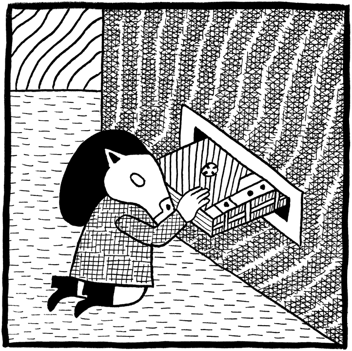
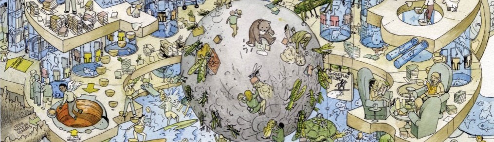
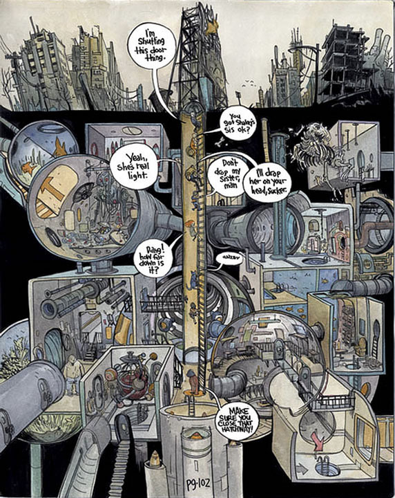
One of his constant visual motifs is connection – his settings tend to crawl with plugs, pipes, wires, tunnels, speakers, drains, cables. And every portal – every manhole, every powerline, every side-door and burrow and off ramp, these conduits and byzantine pathways with which his work is compulsively filled – leads somewhere into some new story, some undiscovered country: a dirty joke, a harrowing secret, a hidden community, another world containing rituals and hieroglyphs and pocket dimensions of its own. Like in a Robert Altman movie or an Thomas Pynchon novel, it’s sometimes hard to follow the central narrative – your attention is always running off in seven directions, chasing some glimmer of questionable magic that flickers across the page and flits out of view.

farel 2

DELUSIONAL, then, while theoretically a book of ancillary material, the bits & bobs of a career’s worth of restlessly inventive cartooning, seems to me to be the genuine article, the thing itself – what we talk about when we talk about Farel Dalrymple. It’s his back streets and back pages – his messy, teeming imagination, given outlet over time in sketches and illustrations and strips. The margins, the gutters between the panels – that’s where Farel really lives. And while we can’t really go there with him, we can chart his progress and receive his reports. We can eagerly await his postcards from the edge, which sometimes arrive in art books like this.

farel

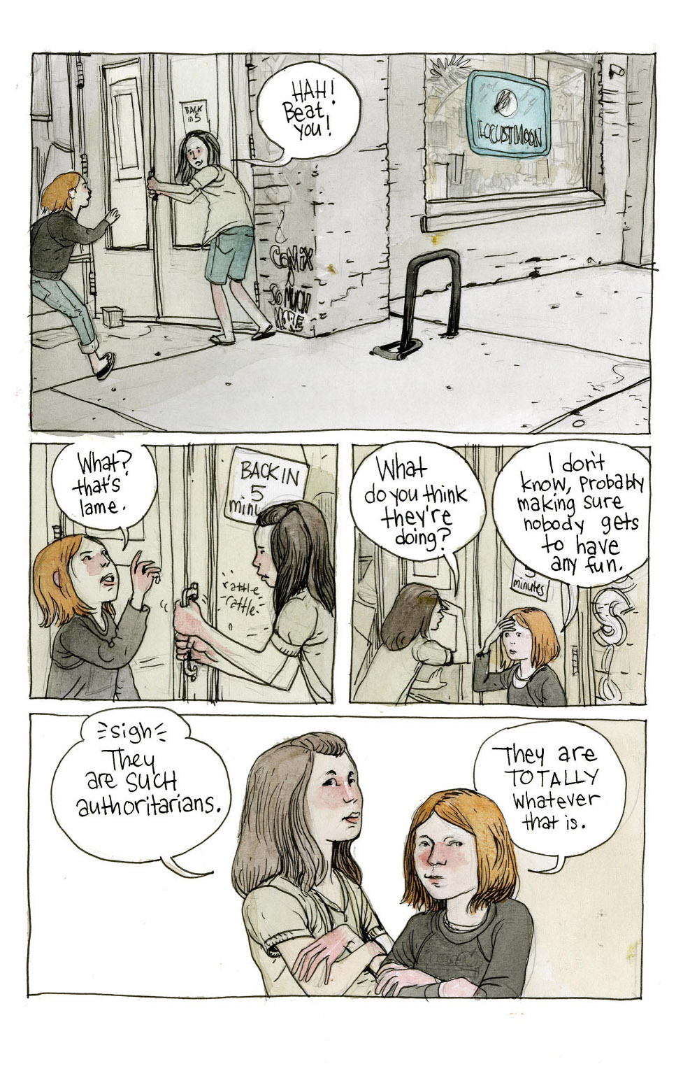
As anyone who follows this site is probably aware, whatever minor success Locust Moon has had is largely due to Farel, who has been a friend and collaborator since day one. From his gorgeous ONCE UPON A TIME MACHINE cover to his sketchbook pages in QUARTER MOON to his back cover blurb in Rob Woods’ 36 LESSONS IN SELF DESTRUCTION, he has been involved in some capacity in every single book we have ever produced. He is a blood brother and feels like as much a part of Locust Moon as my own partners.

When I think of Farel, I always think of the brutally hot Philadelphia summer of 2011, and the first book ever published by Locust Moon. Farel was visiting from Portland, and we (Farel, Chris Stevens, Rob Woods, Jimmy Comey and myself) spent two weeks locked in a huddle in our failing comic shop with its broken AC, blissfully undisturbed by our as-yet-nonexistent customer base, working til all hours of the night on what we creatively entitled THE LOCUST MOON COMIC, a purposeless but joyful tribute to the imaginations of two little girls.

LMinteriorpages-5

To be camped out with these brilliant, passionate people breaking down stories, thumbnailing pages, watching a 22 page comic come together before our very eyes – it was not my first experience making comics, but it was the first time I realized that the only way to do it properly was to throw yourself at it, body and soul. It was my first great high – that incandescent thing that addicts always talk about – and I’ve been chasing it ever since.

LMinteriorpages-20

Ever since those nights watching Farel blearily sling watercolors on the couch until 6am, I have been constantly inspired by the full investment with which he approaches his work – giving himself to it completely, refusing to compromise on his bizarre, brilliant vision, sometimes to the detriment of his career, but always to the benefit of his readers and friends. He’s never tried to bring his enormous skills to the marketplace – he’s just tried to find ways to get paid for his inscrutable impulses. The mountain will come to Mohammed. And he’s found an audience that will follow him, marching to the off-beat rhythms of his weird old drum, down alleyways and obscure channels, hoping to trace every wire to its mysterious but self-sustaining power source, searching to see where it all leads.

farel 3

DELUSIONAL is a guided tour of this strange & extraordinary imaginative machinery, and we are privileged to watch it work and worry over more than a decade, knotting and unknotting, stringing and contorting itself along ideas and tensions that are never resolved, but return in new forms, speaking with new voices, adapting, vanishing and reappearing down those outlets and burrows that connect page after page. It sometimes reads as compulsion, not intention: there’s an imbalance – too much is going on in this brain and spirit, and it needs release. Farel’s characters aren’t sock puppets that he uses to tell stories, they’re not slotted into plot points – they’re organic, evolving creatures, and sometimes they need to be taken out for some light and air.

farel 4

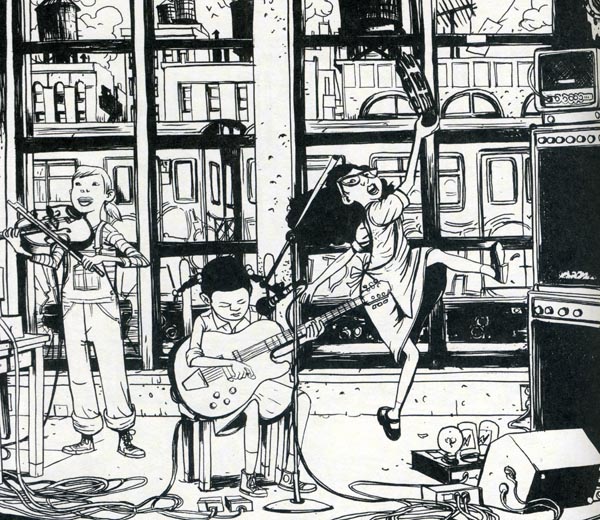
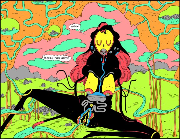
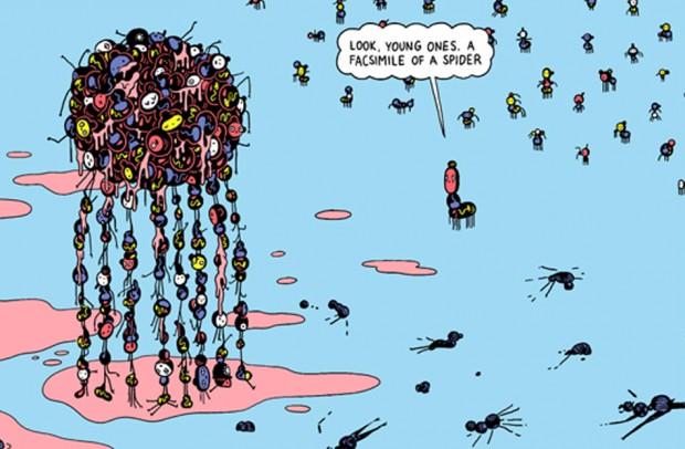
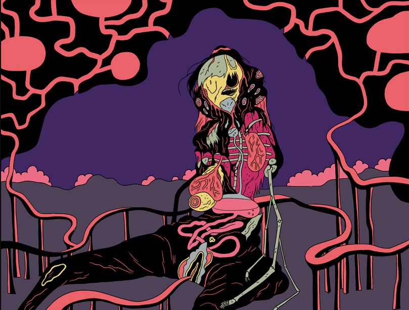
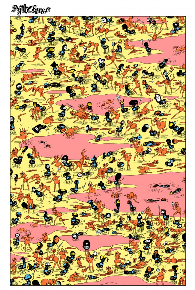
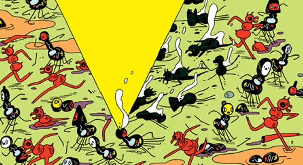
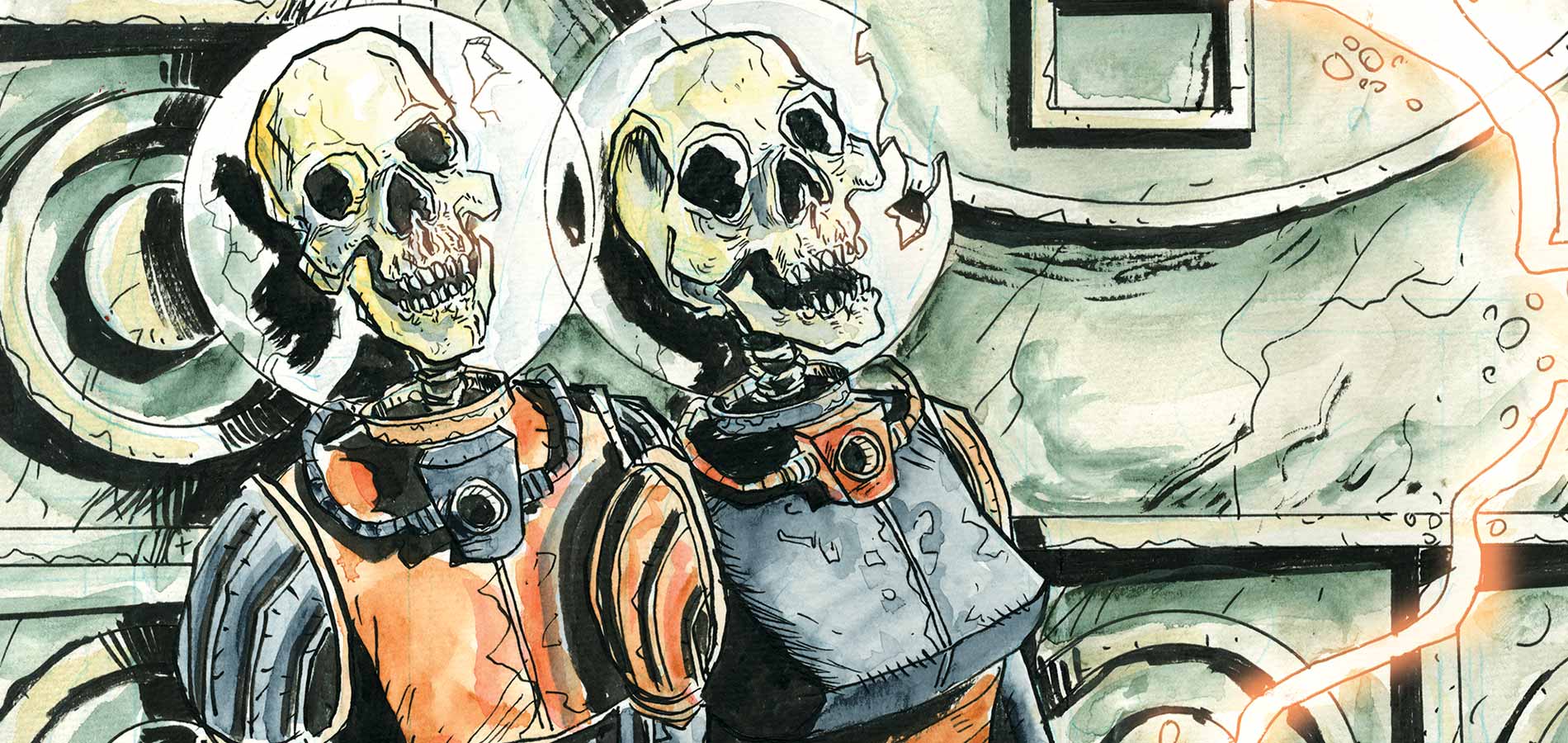
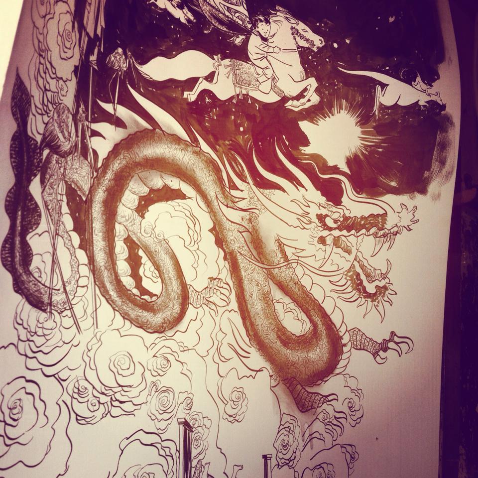
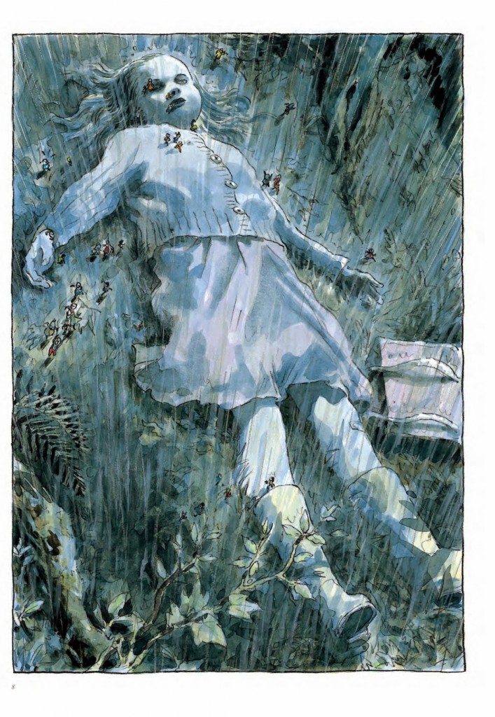
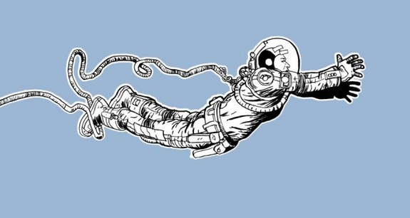
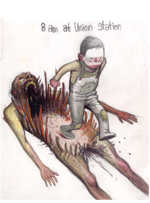
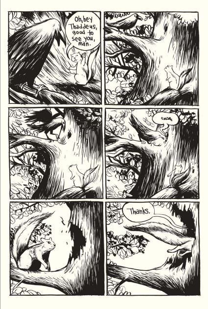
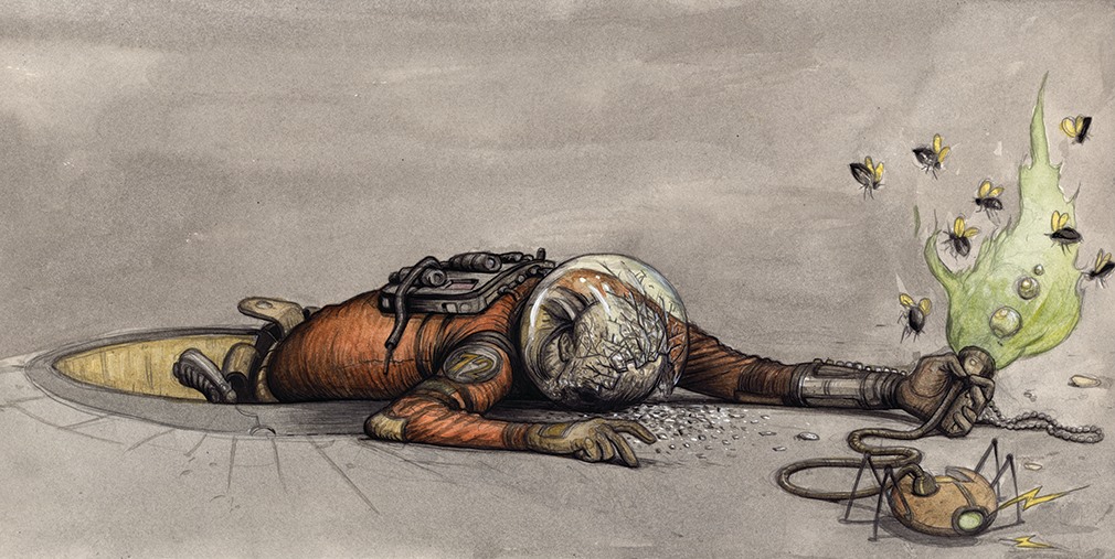
And that, maybe, is the delusion of the title – Farel thinks these people are real. Orson & Smith, Barch & Belf, Almendra Clementine, the Regular – Hollis the pudgy sad-sack superhero, Percival the bespectacled goldfish, Emily the cool-tempered rocker – the space-suited kids with detachable hands, the robotic mice and virtual reality cats, the dorks in helmets, the barbarians with broadaxes, the astronauts in trouble – the creeping Shadowsmen that seem to slither their way into story after story – these and so many others keep returning, swimming into view, weaving in and out of the pages of this book freely, without the strictures of master narrative to pin them in place, changing forms, swapping personalities, appearing in various versions. There is no playing-pretend in these comics about flying fish and talking rats – there is just giving voice to these singular characters and their urgent, muddled messages.

farel 8

The sensitivity of this exploration and cartography, the absolute obedience to the internal voices and their various ways of expressing themselves, the willingness to follow rather than lead – that’s the true negative capability required of great artists. Above all, Farel listens, watches, thinks – lets the wind blow through him.

And I’ll be damned if this snazzy little casebound hardcover – appealingly designed by Chris Pitzer with subtly shifting colored paper and a vibrant sky-blue cover – this collection of by-definition non-essential material might not be the best place yet to see Farel’s remarkable imagination at work, absorbing everything, observing itself, processing the world into strange, moving comics and drawings.

Or, as Farel more simply puts it in his detailed, conversational index, “Most of the stuff in this book is stuff that came up out of my own brain.”

farel 6

-Josh O’Neill

good this week

stray bullets killers #1 & stray bullets uber alles edition: back with a bang, david lapham’s ‘lost’ masterpiece returns this week with an ‘uber’ edition that collects the original series, an issue that wraps up the original run, and this brand new series. lapham crafts crime stories that read like slice of life tales from the suburbs. he’s a pretty flawless storyteller, and anyone who hasn’t checked out the world he created in STRAY BULLETS is urged to get into it.

Image

Image

beasts of burden hunters & gatherers : this book is an instant smile whenever it comes out. evan dorkin’s wit and characterizations perfectly inform the watercolor world of animal paranormals that jill thompson paints. down to the distinctive lettering of jason arthur, all the details are in place to immerse you into this charming, sometimes scary world tailor-made for anyone who loves animals or hellboy.

Image

Image

secret avengers #1 : this reads and looks like an outtake from HAWKEYE & FRIENDS. that’s a good thing. bang-up job establishing the team and tone here by ales kot and michael walsh.

Image

Image

the fox #5 : haspiel & company go out with a bang, wrapping up the initial arc with all the whimsy, winks, and cartoony punch the series promised. lots of good character beats here that make me look fondly toward the next, just-announced run.

Image

cannon by wallace wood : the master does comic strips like no one else before or after. a pristine collection of wood’s military journal strips produced as entertainment for those soldiers overseas during the height of the cold war. so, so good.

Image

east of west #10 : onwards with one of the best monthly series in years.

Image

manifest destiny #5 : continually entertaining. a nice change of pace book.

Image

ff volume 2 tpb : wrapping up matt fraction & mike allred’s run on one of the best things to come out of MARVEL NOW.

Image

–chris stevens

ANT COLONY by Michael DeForge

antMichael DeForge’s ANT COLONY is a wonderfully whole piece of comics craftsmanship. Externally baffling but internally consistent, it does what great art comics often do – it teaches you how to read it. Best experienced in a single reading, it’s a book that you swim through. And by the time you reach the far shore, gasping for air, you’re tempted to return to the beginning and dive back in. Not because it was such a pleasurable reading experience, but because you’ve only just absorbed its language. Now that it’s over, you’re finally ready for it.

It begins with a statement of ennui that’s at once existentially universal and hilariously particular. It’s like the setup of a joke: two ants stand on a decomposing apple, and one asks the other, “Why does everything have to be so tiny?”

“I’m just so sick of this itty-bitty lifestyle,” he goes on. Most of us can relate – who hasn’t anxiously pondered their own insignificance? – but there’s something disorientingly funny about watching an ant’s spiritual crisis as he discovers his own puniness. It gives us a God’s-eye-view while speaking directly to our experience. We’re drawn in and held at bay, watching the ant farm and staring out from behind the glass.

ant 2
That seems to be DeForge’s great trick in this disturbing, uncomfortable opus of a graphic novel, and it forms a tension that never slackens. We’re introduced to a large cast of ants and other bugs in a detailed, surreal insect world. We’re given so much to identify with, so much that’s recognizably human – the dissatisfaction and intractable misunderstandings of a squabbling couple; a child dealing with his abusive, mentally ill father; ants sitting on couches, watching TV, bitching at one another. But there is also so much that is strange, repulsive, and unknowable – the boy who inhales a cloud of microscopic earthworms and is transformed by them; the spiders with the heads of Tex Avery wolves, who copulate by extending worm-like appendages into one another’s bodies; the queen, drawn like some byzantine flat-perspective centerfold, her legs spread as she’s rotting and dying. The book invites our identification, then rejects it. It gives us recognizable figures in an alien world – one as frightening and foreign as (if not particularly similar to) the insect kingdom itself.

abt 8

Though there are a lot of strange pleasures to be had here for the reader who enjoys this sort of thing – morbid comedy abounds, DeForge’s linework and design sensibility are inimitably striking, and the bold color choices are directly appealing – ANT COLONY is at its core a very dark, ugly book. DeForge creates situations in which we expect the drama of human connection – a couple divided by war; five runaways trying to find or build a home; an orphaned child, rescued and raised by enemy combatants – but instead gives us amoral coldness. In one typical exchange, one ant says, “What are you doing? Why are you trying to drown that baby?” and his boyfriend replies, “I dunno.” There is a lot of murder and death in this story, none of them crimes of passion – they’re all committed with a casual shrug, as a procedural necessity or a way to fend off boredom. These ants seem to kill each other the same way we kill them – absentmindedly, and sometimes for no reason at all.

ant 4

The exception is that one ant from the opening, the one bemoaning his itty-bitty stature. He seems to feel in a recognizably human way. He meditates, declares himself a pacifist, and refuses to take part in the war with the red ants. He reaches out for his boyfriend, who’s never anything but surly and aggressive. When he and four other ants go on the run, he tells them that they’re a family now. Watching his constant (sometimes pathetically needy) attempts to engage emotionally as they’re met by the pure autistic insectoid impassivity of the characters around him is the most affecting element of the book, its emotional core. But don’t mistake him for a point of view character – DeForge’s storytelling here has a blank, loveless gaze. Though often hilariously funny, his point of view is algid and bleak.

ant 7

Last week I reviewed Drawn & Quarterly’s translated edition of BEAUTIFUL DARKNESS by Fabien Vehlmann and Kerascoet; these two books make excellent companion pieces, if you enjoy being ushered by stellar cartoonists into the heart of teeny-tiny sociopathy. But there is a key difference: while both are frightening and morbid books, the reading experiences diverge. BEAUTIFUL DARKNESS, for all its existential snarl, enraptures you with beauty and cuteness, begging you to offer up your heart for it to devour. It fills you with rage and hurt. ANT COLONY, meanwhile, has a flat affect and implacable presence. Both stories sweep you through carefully designed, grimly vicious universes, baffling nightmares where nothing vulnerable is safe, and where weakness is death. The difference is that BEAUTIFUL DARKNESS is a tragedy, and ANT COLONY thinks that shit is funny.

ant 3

-Josh O’Neill

good this week

moon knight #1 : warren ellis steps in with a fresh take on a difficult character, and declan shalvey takes his game to a new level with killer pacing, characterizations, and design. and a swanky new look for our crazy hero.

Image

Image

turok #2 : this is an inventive new spin on a classic character, with sensitive, imaginative writing from greg pak and fine art from mirko colak.

Image

batman/superman annual #1 : a straight forward superhero romp graced by the exquisite art of jae lee and june chung.

Image

Image

uncanny x-men #18 : marco rudy, fresh off a bang up stint on marvel knights spider-man, weaves and winds through this issue with some of the most interesting layouts in a long time.

Image

afterlife with archie #4 : a powerful issue that hits you with a punch. this book is just getting better, somehow.

Image

jupiter’s legacy #4 : the best issue of this series so far, with some enjoyable character moments and peak frank quitely art.

Image

she hulk #2 : the first issue was no fluke. charles soule and javier pulido (and THE PRIVATE EYE’s muntsa vicente!) are on to something special here.

Image

starlight #1 : i hope this is the breakout book goran parlov so richly deserves. this is a gorgeous comic with impeccable design and storytelling on parlov’s part, and mark millar has a fun concept lined up.

Image

Image

wolverine and the x-men #1 : summer school kicks off at the jean grey school, and the kids are in good hands with jason latour, who slides right into jason aaron’s place with enough of his own voice to make things feel fresh, and mahmud asrar, who’s come a long way from his digital webbing days.

Image

velvet #4 : top-notch spy thriller from brubaker and epting. this series is really finding its groove.

Image

trillium #7 : we’re nearing the end of this fantastic mini series.

Image

–chris stevens

Tuesday Tease

Special treat this week: another page for you from our biggest labor of love, LITTLE NEMO: DREAM ANOTHER DREAM!

Toby Cypress has wowed us consistently, from the epically badass RODD RACER to his newest, killer series from Dark Horse, THE WHITE SUITS. Toby came by the store last week to celebrate the release of THE WHITE SUITS’ first issue (of which we still have some signed copies – get one!), and we had a grand old time. He also pitched in on our little anthology mag QUARTER MOON to provide one of our favorite covers to date. We can’t get enough of this guy.

So enjoy the glorious, beautiful insanity of Nemo’s dreams unbound in Toby’s vision of Slumberland:

LittleNemo_LocustMoon_TobyCypressToby will be selling prints  – and if you’re lucky, maybe even the original art! – of his NEMO contribution soon, so look out for those at the Out of Step Arts website.

Here’s a glimpse of that original art in progress, which Toby shared with us:

tobycypress_nemo_tease

And remember, you’ll see that beast among good company this fall in LITTLE NEMO: DREAM ANOTHER DREAM. News on how and where you can reserve your copy of the book will be coming before you know it.

– Andrew Carl

By the way, we’re keeping this list of Nemo names updated with most of the contributors we have publicly announced – so check it out if you’re wondering who else has signed up! And our first revealed pages from the book can be found here.

an evening with toby cypress

we are pleased as punch to have toby cypress at the shop tonight. toby is, for our money, one of the finest artists working in comics today, and it’s an honor to have him be a part of both LITTLE NEMO: DREAM ANOTHER DREAM (his page will melt your eyes) and the not yet officially announced sequel to ONCE UPON A TIME MACHINE. tonight we celebrate the release of the first issue of toby’s new series from dark horse, THE WHITE SUITS. cartooning and conviviality will prevail.

and the first 10 folks who buy one of toby’s books and spend $20 will receive a free print exclusive to this evening. it’ll look a little something like this…

Image

RSVP & details at the Facebook event page:
https://www.facebook.com/events/508391562607039/

The LOCUST MOON TOP 40: February 2014

40. UNDERTOW

With an intriguing premise from Steve Orlando and moody, expressive artwork from Artyom Trakhanov, we can’t wait to see where this new Image title takes us.

undertowfeature

39. SUPERIOR FOES OF SPIDER-MAN

Following Hawkeye’s mix of humor, character-driven realism, and gleeful formal experimentation, SUPERIOR FOES OF SPIDER-MAN has quietly become one of Marvel’s very best books. Don’t let the secret out, but it almost seems like somebody over at the House of Ideas got it in their head that superhero comics are supposed to be fun…

38. This Shirt

Yeah, what if??

What-if-Zelda-was-a-girl-T-Shirt

37. THE BUS

We detect some of the spirit of Winsor McCay in Paul Kirchner’s quietly masterful surrealist comic strip.

thebus_paulkirchner

36. B + F

We were pleased to play host to Greg Benton and his huge, beautiful nightmare of a graphic novel. Greg is one of our favorite cartoonists and one of comics’ most righteous dudes, and we can’t wait to see what he does next.

B+F-COVER-wrap©2013gregory-benton

35. INSECT BATH

True to its title, this new alt-zine style anthology series feels like a submersion in the creepy, underfoot world.

insect

34. SPRING TRAINING

Baseball beckons, and with it a world made new.

Continue reading

good this week

deadly class #2 : a strong issue that cements my hopes for this series. we get into the whole school aspect of things, and it’s a lot of fun meeting the various cliques. wes craig kills every aspect of the art–design, character, layout.

Image

hawkeye #15 : it feels like things are coming to a head for clint and his building. any time david aja drops in to draw an issue it elevates an already good book. this run is going to be an evergreen.

Image

batman/superman #9 : JAE LEE.

Image

Image

Image

elephantmen #54 : a killer cliffhanger for one of the very best serial reads there is.

Image

black science #4 : after a couple of issues that, while still excellent, felt like they were racing to keep up with the explosive debut issue, this feels like it’s leading us out of the fire and into the frying pan.

Image

sock monkey treasury : a gorgeous new collection of one of the more idiosyncratic cartoonist’s most accessible work.

Image

wolverine and the x-men #42 : jason aaron, nick bradshaw, chris bachalo and company wrap up their run on what has been one of the most fun books of the last few years. and they do it in style, with a touching, chuckling read that feels just right.

Image

miracleman #3 : you can argue with the way marvel has rolled this out, but you can’t argue with the material. this issue leads us into the truly masterful work alan moore does the rest of the way.

Image

–chris stevens

memory lane

i’ve got a couple of boxes of books from my personal collection here at the shop, and i went through them for the first time in ages today.  these books still hold such wonder for me. stuff like…

Image

on the surface it’s just about the goofiest book ever, but i must have read this 500 times. there’s the great paul smith cover and a script from j.m. dematteis that felt so real and relatable to my 8 or 9 year old self.

Image

when i was a kid i felt like the x-men was my own private soap opera, and issues like this one were a big reason why.

Image

these issues of gi joe that really built the snake-eyes/storm shadow relationship were so filled with mystery and excitement. to this day two of the coolest costume designs in comics.

Image

batman & Ethe outsiders was probably my favorite super hero book outside of x-men when i was a little kid. frank miller, doing mike barr a favor i’m guessing, set the tone here with a great cover, and inside we get a classic old school confrontation between the team and a group of government-led goons called, yes, the force of july. glorious stuff.

Image

i could probably write a 1000 words on how much i loved, and still love, the two gumby books arthur adams did in the 80’s. here arthur employs a slightly less ornate style than usual for him at the time, and the result is a delightfully pure cartoony look. even the little odds & ends arthur drew here–a bio pic of him as a scarecrow, a pin-up of gumby & pokey riding a dinosaur–are fantastic. these should be reprinted in a proper edition, not the sad shit show of a book like the digest version that came out a few years back.

Image

practically forgotten today, atari force was a better book than it had any right to be. 30 years later it holds up as a fine read, particularly the first dozen or so issues penciled by the great jose luis garcia lopez. this issue, filled with all kinds of interesting critters, was a favorite.

Rocket Raccoon 1

my love of this little guy is well known amongst my pals. true story: my mom’s dad was an alcoholic ww2 vet who i saw in alternatingly sweet and scary visits. one of the last times i saw him before his suicide i stole $5 off his dresser drawer top. i bought this comic with it.

–chris stevens

BEAUTIFUL DARKNESS by Vehlmann & Kerascoet

beautiful 1

One brief caveat: you should not be able to name something BEAUTIFUL DARKNESS, unless that something is an Avenged Sevenfold song or a student-run high-school poetry magazine. I’m going to extend the benefit of the doubt and assume that it sounds better in its original French, more like a gorgeous and powerful graphic novel than the LiveJournal page of a 17-year-old aspiring cutter. Because this book, newly translated by Drawn & Quarterly, is the best thing I’ve read in 2014.

beautiful 3

It starts with a tea party and ends with a holocaust. Our protagonist Aurora is shyly flirting with the handsome, dandyish Prince Hector over hot cocoa and cakes, when red globs begin to drop from the ceiling into their food. Confused, the two crawl into a wet, dark tunnel, where they see other cartoon people confusedly clamoring through the shadows. They climb up into some kind of cavity, out from their cover into the pouring rain, part of a refugee throng. Then the view opens up to give us context, and our stomachs drop.
Beautiful-Darkness-body-707x1024

By the next morning the little people have set up camp around the girl’s body, cleverly re-purposing her belongings as survival supplies. A notebook becomes a tent; a pencil case becomes a watertight sleeping bag. Aurora, with all the pluck and self-sacrificing gumption (as well as the big dew-drop eyes and polka-dot dress) of a Disney heroine, takes it upon herself to lead the effort, setting up a kind of triage & rationing station inside the little girl’s purse. Over a few days, their society takes shape according to its needs and its personalities. Aurora makes friends with the field mice, who help her find berries.

beautiful 4

With astonishing elegance and economy of storytelling, Vehlmann & Kerascoet sweep us through the crisis, introducing their cast of instantly recognizable, idiosyncratic-yet-archetypical characters: Plim, the over-enthusiastic boy sidekick; Jane, the proud, self-sufficient loner with a pair of cuticle scissors strapped to her back like a samurai sword; Zelie, the preening, doll-like narcissist; the bickering ballerina triplets; Timothy, the shy, nurturing wallflower — to name merely a few. In a book that takes barely an hour to read, we are gifted with over a dozen characters who stand in sharp relief, imprinting themselves on our imaginations, such that when the frost takes hold and the plot threads tighten, we find that they have wound themselves, quietly and intricately, around our heart and throat.

The stage is set. We will spend three seasons here (summer, fall, winter — this is not a book about renewal), watching their social order shift as they struggle for survival in the shadow of a young girl’s decaying body. At first the threats are external: a cat, shadow-dark against the purple night, picking children off as they sleep; one of the triplets pecked to death by a bird. There is the expected squabbling over rations and rules, and while it might be said that we’re descending into Lord of the Flies by way of The Borrowers, the place we’re heading is actually much stranger than that.

beautiful 10

This is wilderness at its most gorgeous and frightening. The lush simplicity of these pencil & watercolor illustrations (credited to Kerascoet, which is a pen name for the Parisian artists Marie Pommepuy and Sébastien Cosset) are sumptuously appealing, with their rich colors and delicate play of light and shadow, but they are unflinching in the speed and casualness with which they shade into terror and violence. There is a smiley-face painted over everything, from a girl who’s poisoned by a plant and watches her body revoltingly balloon and malform, to the children playing ticklishly in the maggot fields. There is something otherworldly and profoundly unsettling about the giggling carelessness with which they greet the ravages of nature and society, and the storytelling and gorgeous artwork combine to keep you constantly off-balance in this perfectly realized, rapturously decaying universe.

beautiful 2

beautiful 5

To say too much more would be to spoil this remarkable story (if I haven’t already), which subverts your expectations and implicates you in its horrors by your mere attention, such that by the time you reach its monstrous, shocking end you feel you should close the book with care and slowly back away.

It’s the natural world writ tiny, with cartoon faces and pipsqueak personalities masking a soulless, indifferent universe. This is a very French book: an indictment of mankind itself, the cute masks that we wear, the sentimentality, the tea parties and small kindnesses that hide our sharp teeth, our callous hearts & casual cruelties. And whether or not you share this miserablist view of the human nature, you will queasily recognize something in these characters, in the shrugging ease with which they slide from sweetness to savagery. This is a book that will linger, whether you want it to or not. It will stick to your teeth. It will make you look for the tiny cartoon monsters inside yourself.

beautiful 11

– Josh O’Neill